17/01/11 – Meeting with Vaida
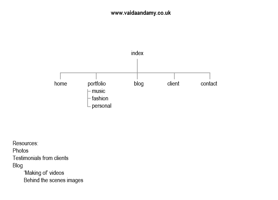
We got together today to discuss our website and figure out what pages we wanted.
- Index: The first page will feature a large image that we feel best describes our collaborative work.
- Portfolio: Will be split into Music / Fashion / Personal to keep the portfolios concise and relevant.
- Blog: This will include behind the scenes videos and images from our photo shoots, we feel this really helps the audience to connect to us, and hopefully will draw them back to the site. We also found another collaborative photographic team http://blog.milojulien.com/ who use their blog to post funny videos and travel snaps mixed in with on set images. This adds value to their work, as the viewer feels they have inside information on how a particular images was created.
Map:
Resources:
- Images from Destruction of Form (Collaborative and Spatialised units), our fabric shoots (MSN4) and our recent band shoot (http://vaidaandamy.wordpress.com)
- Making of videos and behind the scenes images from our fabric shoots (MSN4) and band shoot (not yet published)
- Testimonials from Justina (model from fabric shoots in MSN4) and Philip Davison form the band.
Basic Sketches: These are not to indicate the layout/design of our website but they look at concepts and elements that we have discussed.
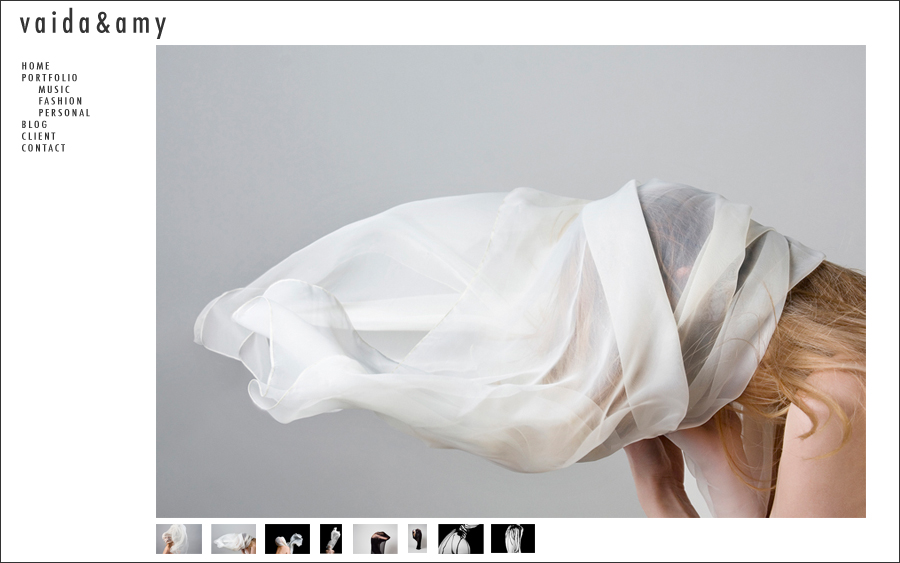
Index: Large image on first page… viewer is instantly aware that they are looking at an image based site.
Portfolio Page: Large image couple with thumbnail navigation that doesn’t move around. This way the focus is still the image, and the viewer is given a visual navigation through the portfolio.
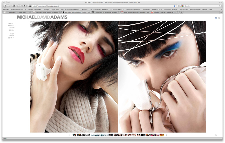
www.michaeldavidadams.com – the thumbnails under the image show the viewer the available images in the selected portfolio. The thumbnails don’t move around like they do on other sites like http://www.milojulien.com/index.php?/works/fashion/. We both feel that when the navigation moves in this way that it is distracting, and some users will get fed up and leave merely because of a navigation technique.


