Inspirations
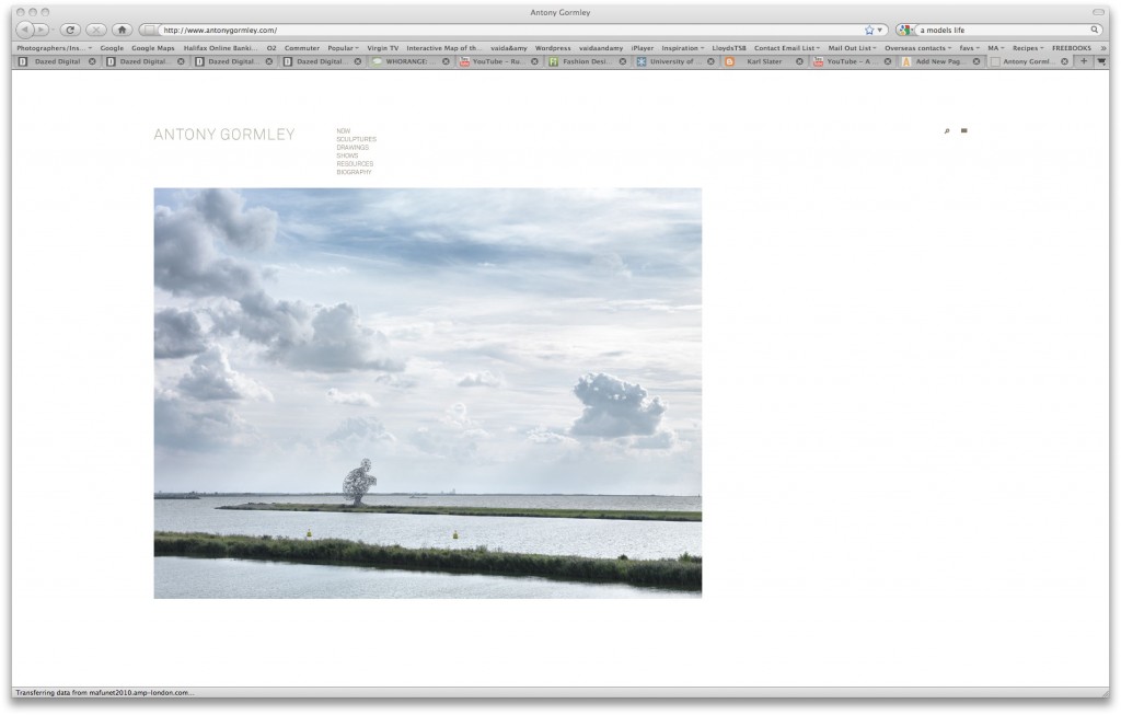
http://www.antonygormley.com/
1. Neutral grey text doesn’t fight with the image
2. Large image makes sure the focus of the home page is his work
3. A full screen and search option adds a professional touch to the site
4. When you click the links in the menu, you get sub menus so the original home page doesn’t look cluttered
5. A muted red is used as the rollover text colour to show the viewer where they are.
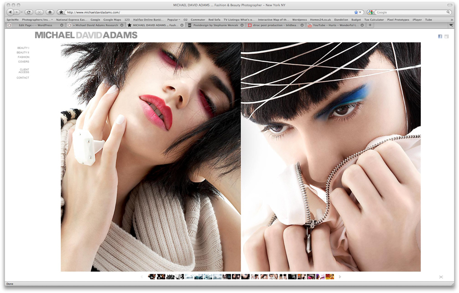
http://www.michaeldavidadams.com/
1. Uses the maximum available size in the browser space to display images – making sure the focus is on the images
2. Neutral grey text doesn’t fight with the image
3. Static thumbnail navigation on the portfolio pages provides an visually interesting but easy to use navigation technique
4. Blogspot and Facebook icons provide links to his social networking profiles.
5. Full screen option provides a cinematic experience of the site.
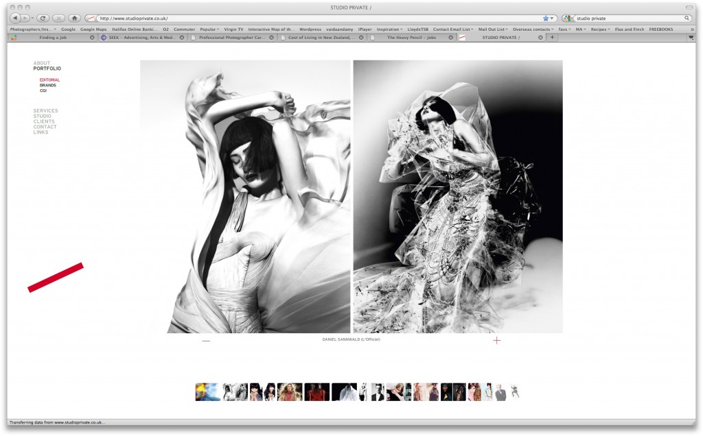
http://studioprivate.co.uk/
1. Large images in the center of the screen draw the focus
2. Slow moving thumbnail navigation, visual navigation
3. Striking red line logo matches the red of the rollover link colour
4. All capitals text has a nice blocky feel, so the typeface isn’t too overpowering
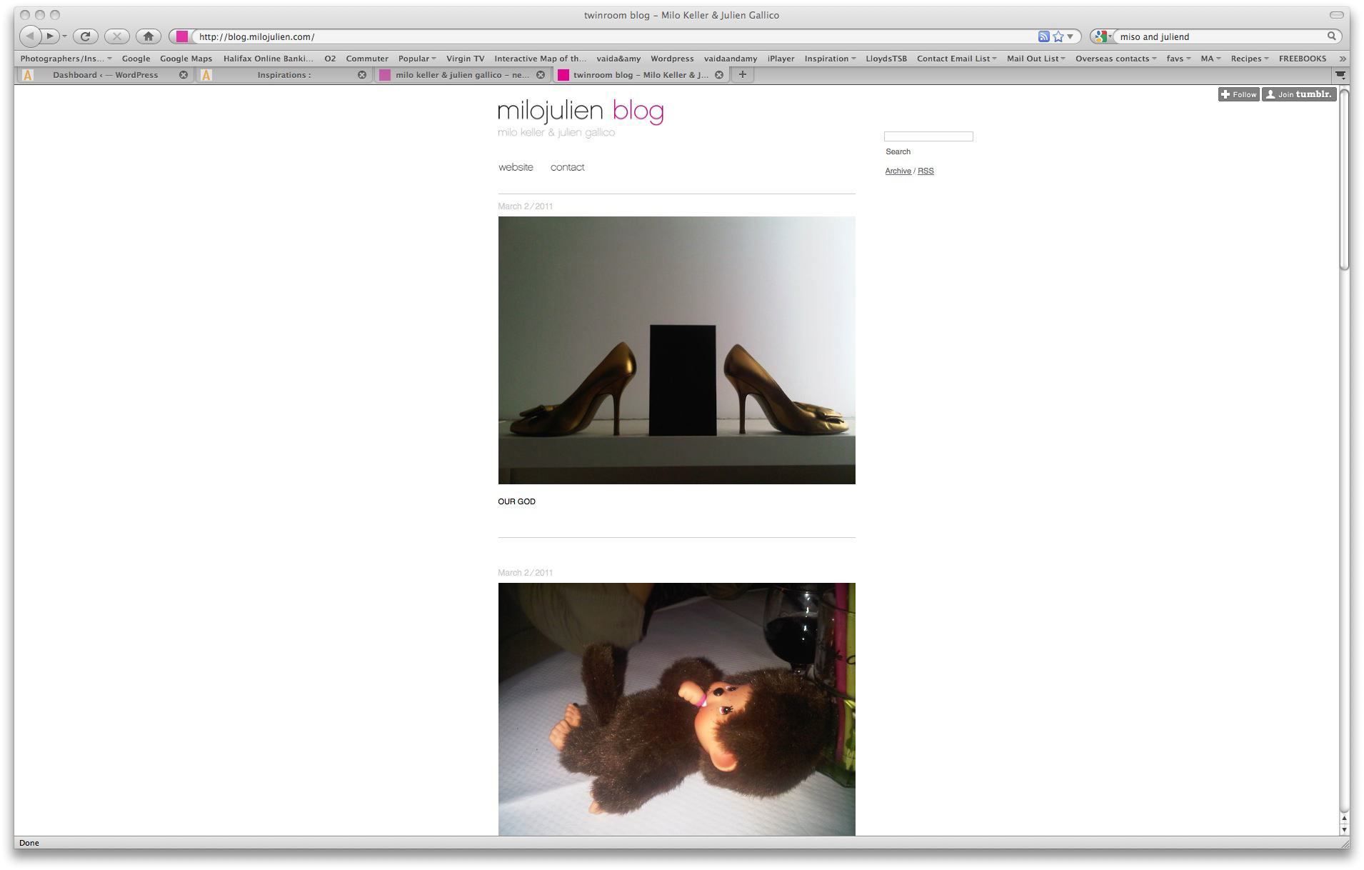
http://blog.milojulien.com/
1. Blog template – a much less formal feel
2. Ability to update more frequently and easily
3. Can let the audience in ‘behind the scenes’


