Colour Palettes
www.antonygormley.com
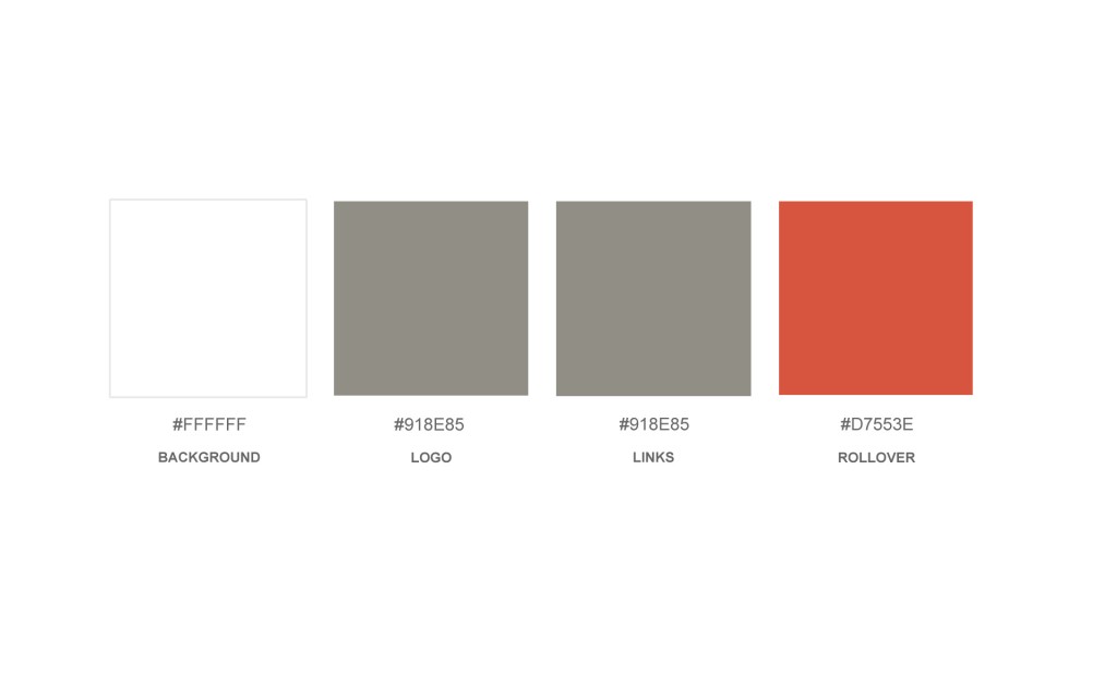
Gormley’s website has a very limited palette, but makes good use of a warm grey tone for the text, and a muted red for the rollover link colour. These add character without distracting from the main focus of the website which is the image.
www.michaeldavidadams.com
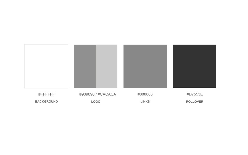
This website is all about the images. The website is entirely designed around the fact that the images use the maximum amount of available space in any browser window. In order to keep the image the main focus, he has used only neutral greys, even for the rollover link states. His images are often saturated and vivid and there is no need for the text on the website to compete with the images.
www.studioprivate.com
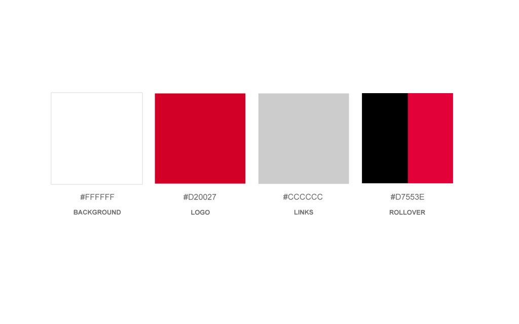
Studio Private has a bolder colour palette, using a bright red for their logo and rollover text. I’m not sure if I would go for that red myself, but it is their logo, so consistency is a factor there. I feel the red is too much, and competes with the imagery.
http://vaidaandamy.wordpress.com
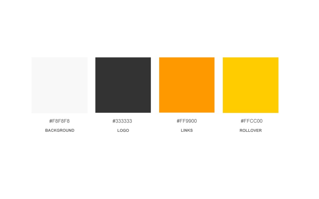
This is the colour palette from our joint blog. We wanted the website and the blog to look consistent (and the blog will eventually be moved over to our own hosting account). The very light grey background just takes the edge off the glare of a pure white background. The logo is a little darker than what we would like on the website, as its a little over powering, so we may knock that back to a lighter grey. The links are a orange colour, and the rollover colour is a not too bright yellow. I think this colour palette is a bit brighter than what we would like to go for on our website. We feel the blog is something that can be a little bit more fun, and not too clean and tidy, but we want the website to be very image focused.
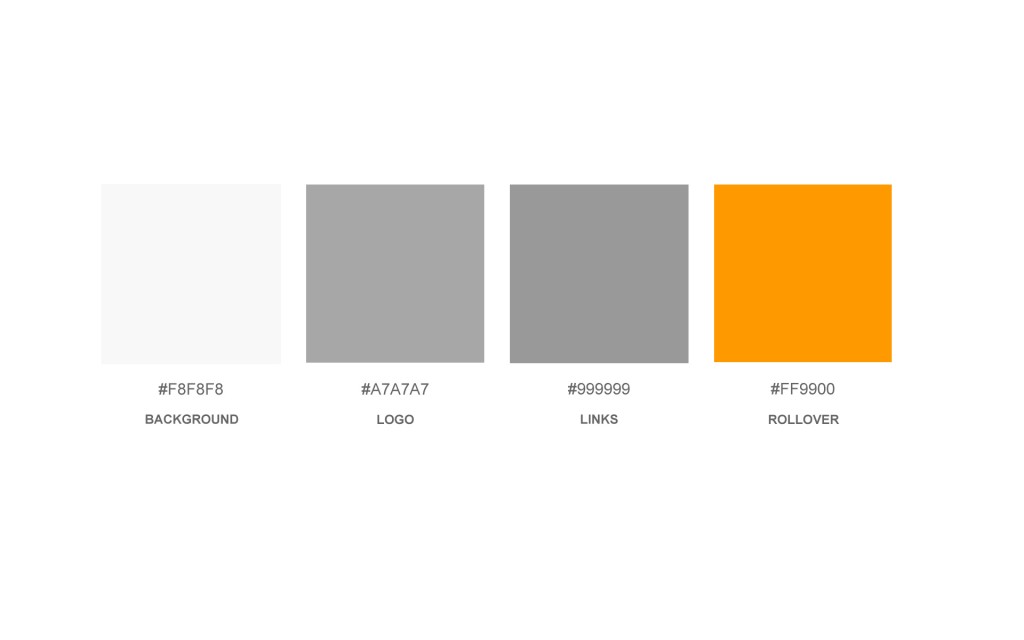
www.vaidaandamy.co.uk
This is our final colour palette. Its most like the Antony Gormley palette – containing mostly greys with one bold colour for the rollover text to aid the viewer in knowing their location in the site. We feel the orange ties in with the blog colour scheme enough without over powering the images, and the neutral greys don’t compete either.

