Using percentages in HTML / CSS
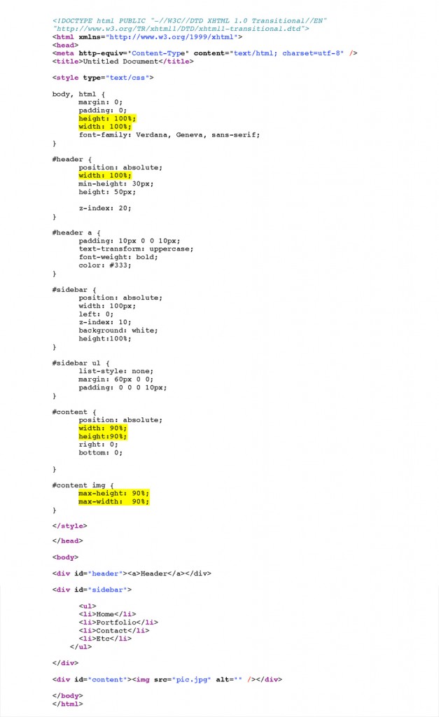
This is some code that Mattew Kibbler wrote for a 100% test page. This outlines the general principles for using percentages.
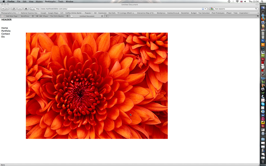
This is the result of Matts code, the big image is fantastic, and exactly what we need for our site. It uses the maximum amount of available space in the viewers browser window.
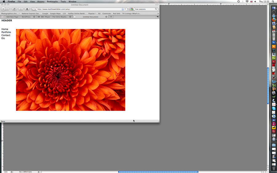
The only problem with this piece of code is that if you reduce the size of your browser window (by dragging the bottom right hand corner) it doesn’t resize the image, you start to loose some of the image, as the overflow is hidden. I think this is caused by the 90% values in the code for #content and #content img.
So I used this code as a base and started to play around with different combination of percentages etc.
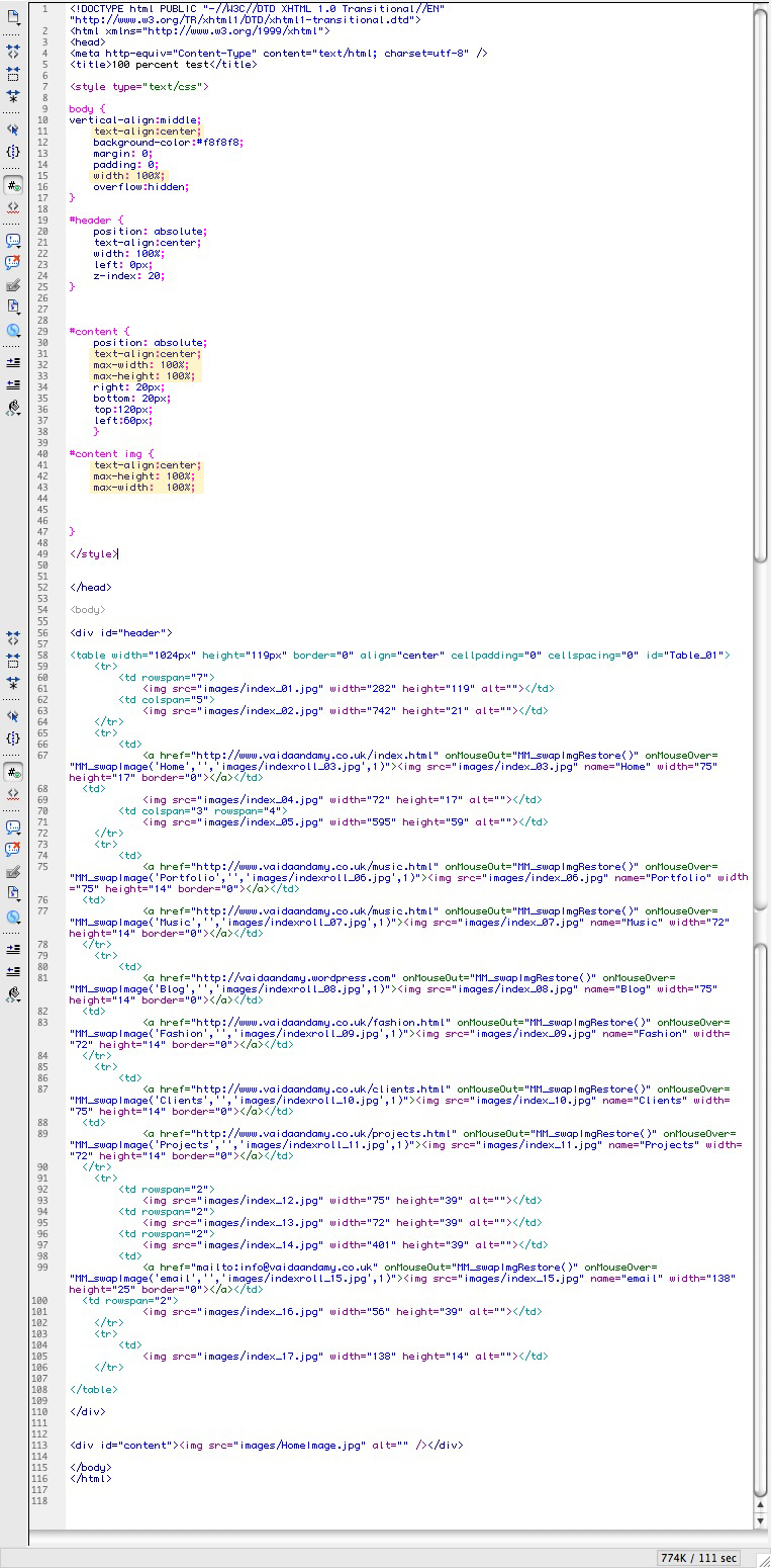
Below, the code highlighted in yellow are the pieces responsible for sizing the image, and how it behaves in relation to the browser window.
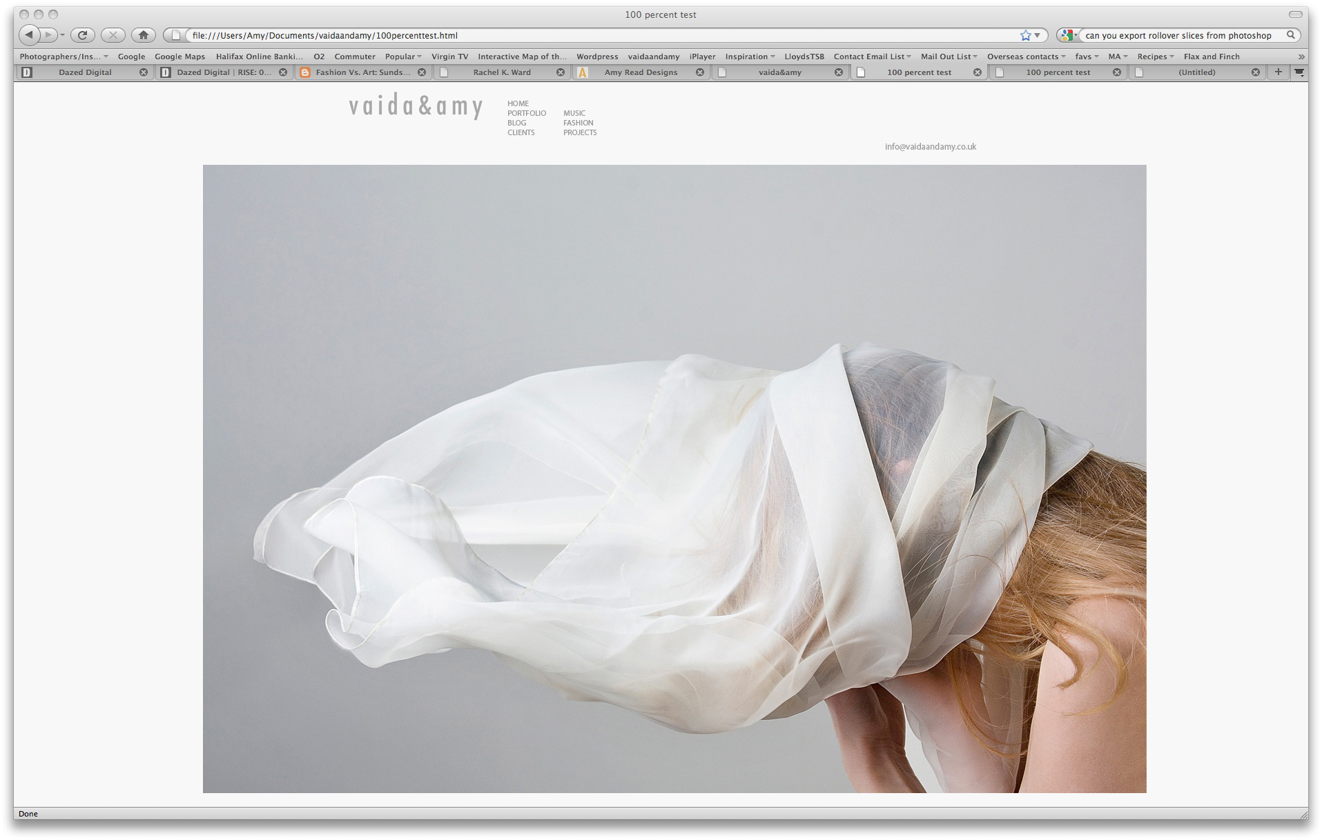
Below is the result of this code. The image is as big as possible in the browser window, and its centered. I thought to begin with I would prefer a centered website, but I feel it looks a bit messy, it just looks like its floating, and a little unstructured. Its also difficult to line the logo and links up with the edge of the image, as the image can be resized to fit the browser window.
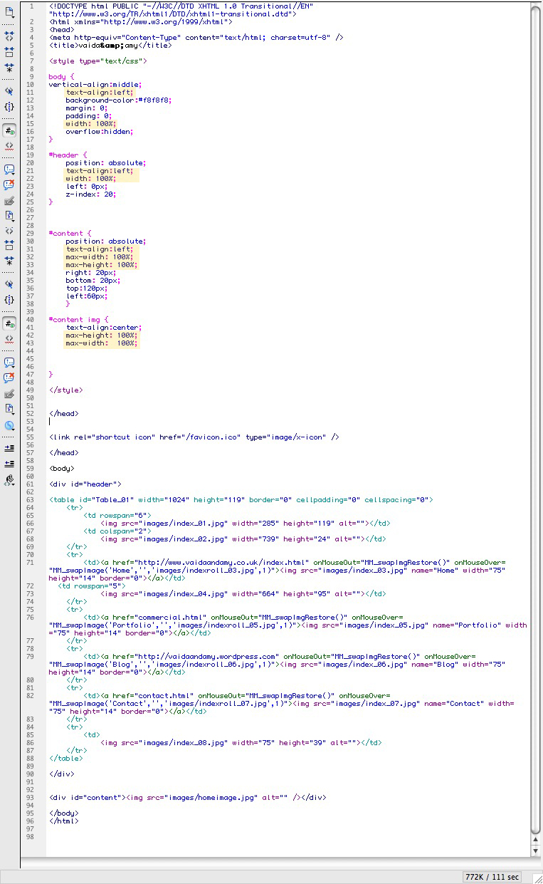
Below is the result of this code. This feels much neater as the edge of the logo can be easily lined up with the edge of the image, but the image still uses the maximum amount of space.
