Design Development
These drafts were a joint effort by me and Vaida, we sat together and discussed drafts as we built them. This allowed us to both be up to date with the development and have an equal input.
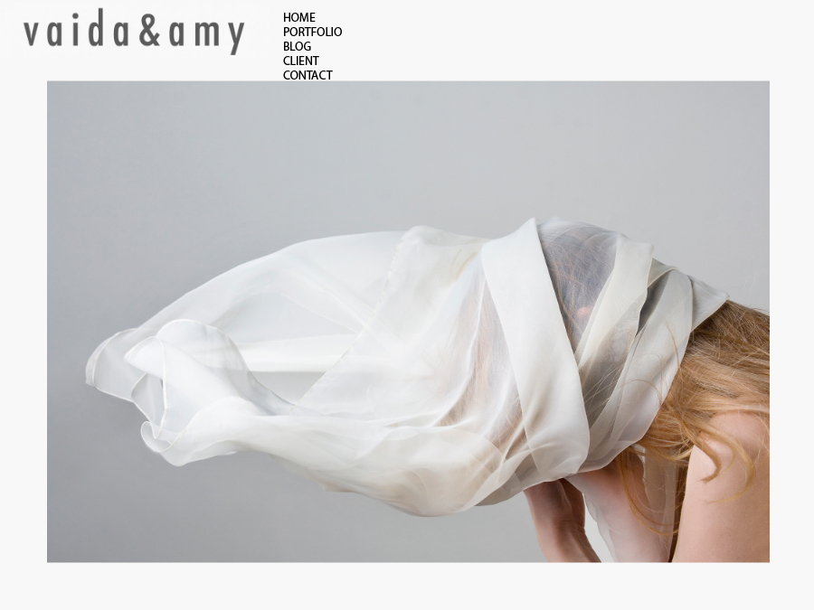
Initial draft –
- Black text too distracting and too big
- Logo too dark, too big
- Image not lined up with either links or logo – looks messy
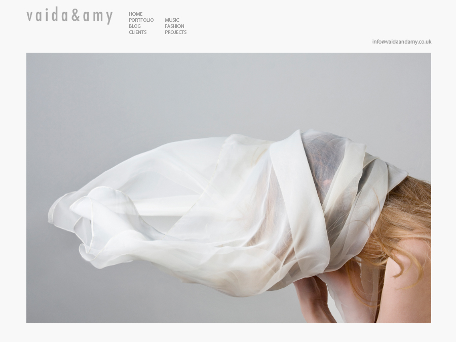
2nd draft –
- Grey text better than black
- Email is distracting in the bottom right hand corner
- Image is lined up with logo – looks much neater
- Orange rollover text is taken from our blogs colour palette – makes the text more interesting and clearly identifies where you are in the site.
- The links in all capitals looks neat.
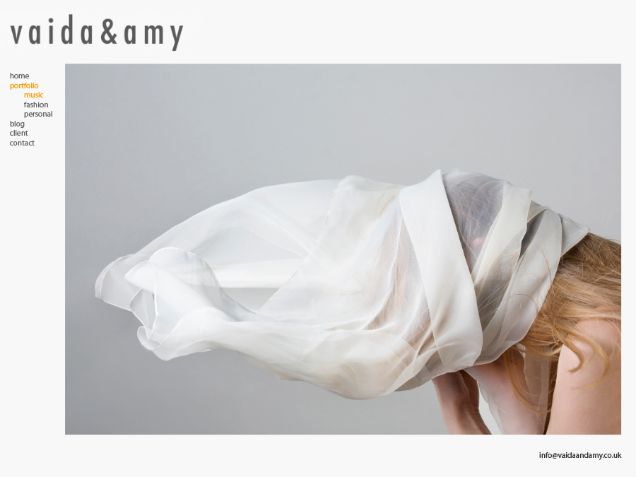
3rd draft –
- Grey text better than black
- Email is distracting in the bottom right hand corner
- Image is lined up with logo – looks much neater
- Orange rollover text is taken from our blogs colour palette – makes the text more interesting and clearly identifies where you are in the site.
- We don’t think the all lowercase links look as neat as the all capitals.
4th draft –
- Logo needs to be smaller and lined up with the left hand edge of the image
- Email is distracting in the bottom right hand corner
- Logo still too dark
- Navigation Menu looks horrible on the left. Messy.
5th draft –
- Smaller logo definitely looks neater and doesn’t compete with the image as much
6th draft –
- Lighter logo looks neater again, and blends well with the links
- Email looks better in the top right, but not sure how it will be lined up when we build the site
7th draft –
- All orange links is way too much
8th draft –
- No email link on home page looks much neater
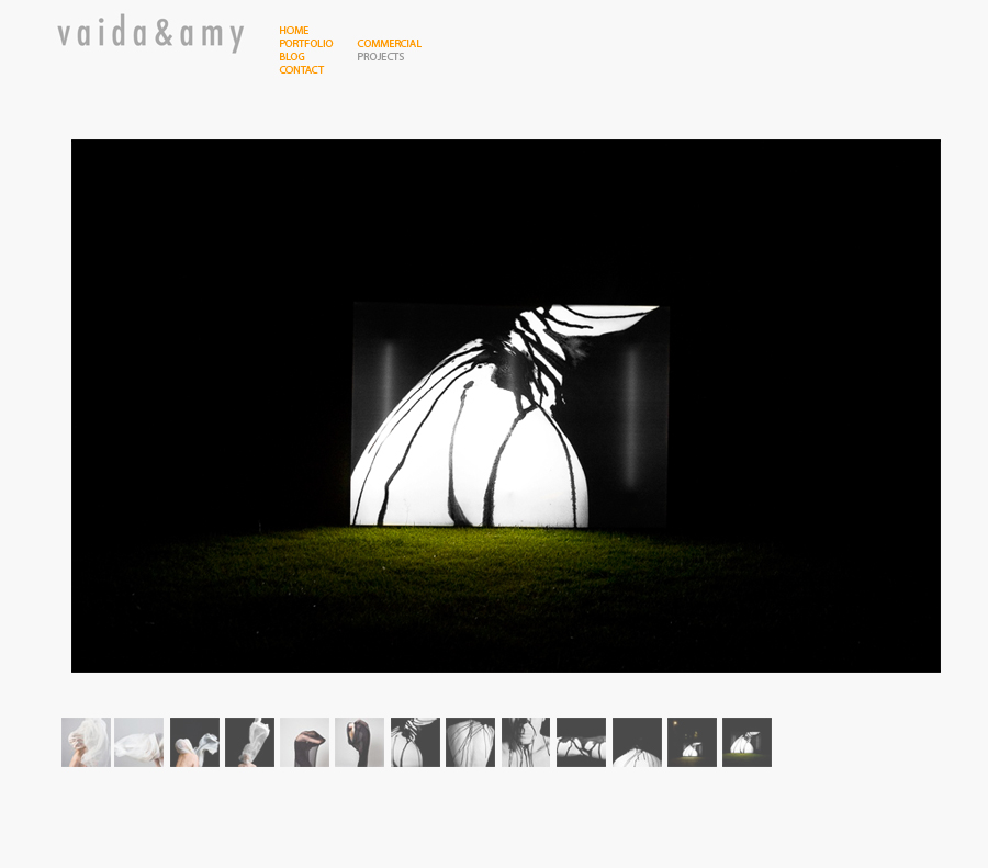
- More space between the logo/links and the image feels more open, less scrunched up
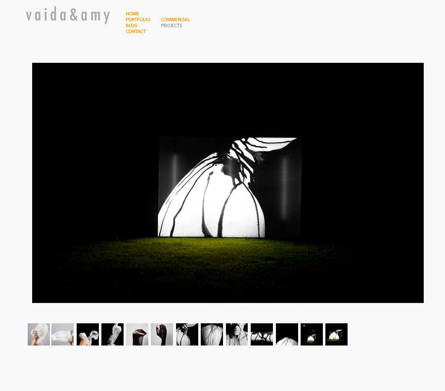
Initial Portfolio draft –
- 100% opacity thumbnail navigation competes too much with the image
2nd Portfolio draft –
- 70% opacity thumbnail navigation doesn’t compete anywhere near as much. Looks much neater.
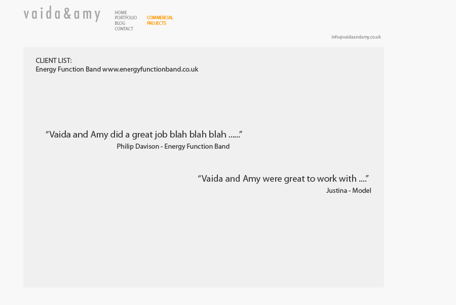
Initial Client draft –
- Text too blocky
- Looks dull and boring compared to the image based pages
- We don’t have many comments as we’ve just started
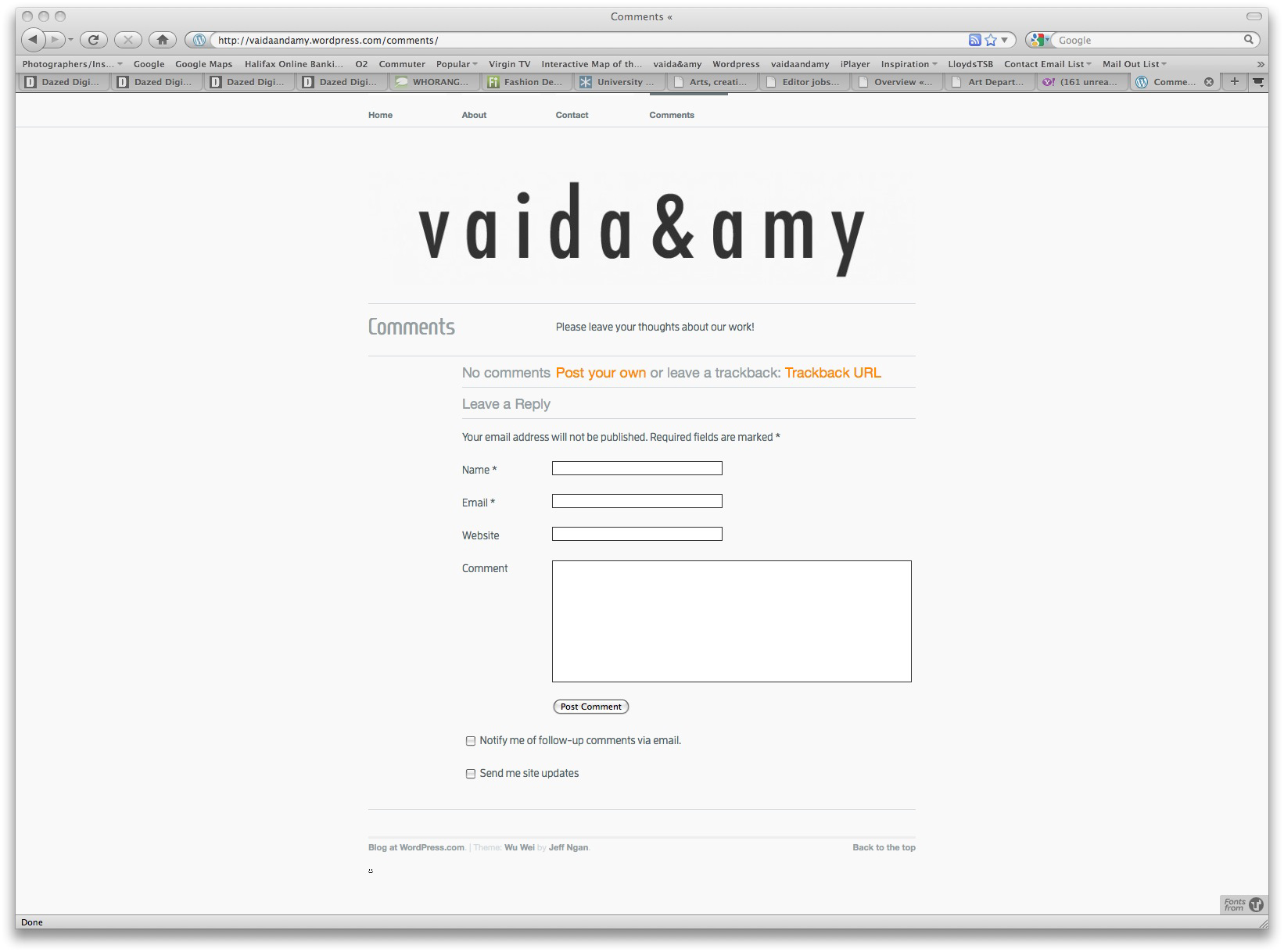
2nd Client/Comments draft –
- Much easier uploading and filtering options
- can be less formal than the website and can be built up over time
- Gets rid of a mainly empty page on the site
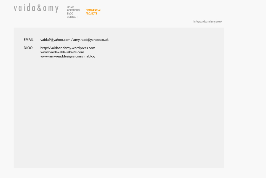
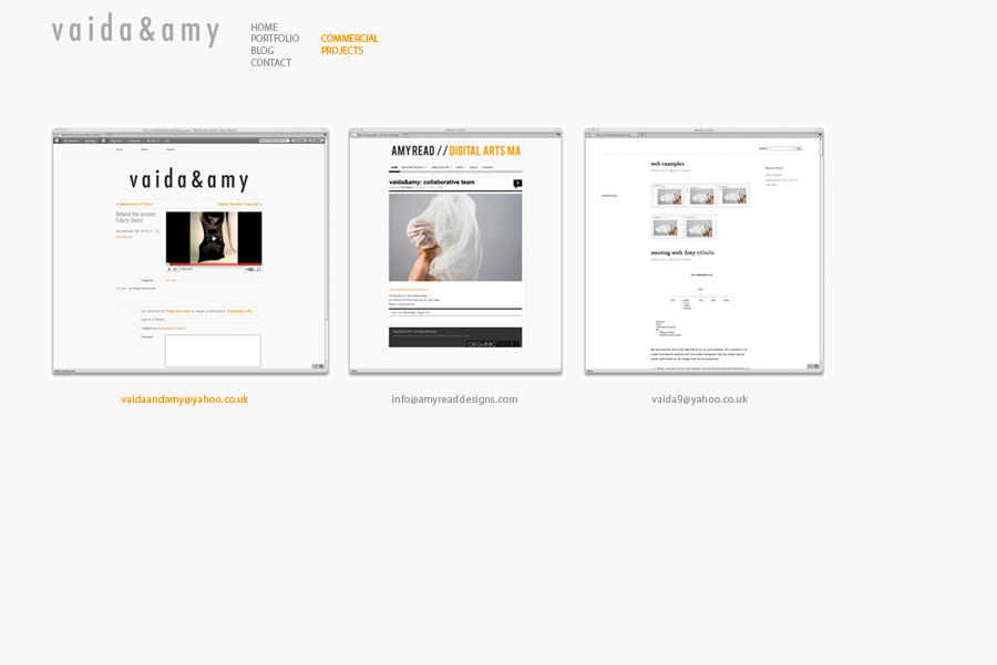
1st Contact Draft draft –
- Dull and boring compared to the image based pages
- Text is bulky and looks unprofessional
2nd Contact Draft draft –
- Visual method of doing the same thing
- The screen shots are much more appealing and gives the viewer a preview of the site they will be going to
