Editing Cinemagraphs
Colour vs Black and White:
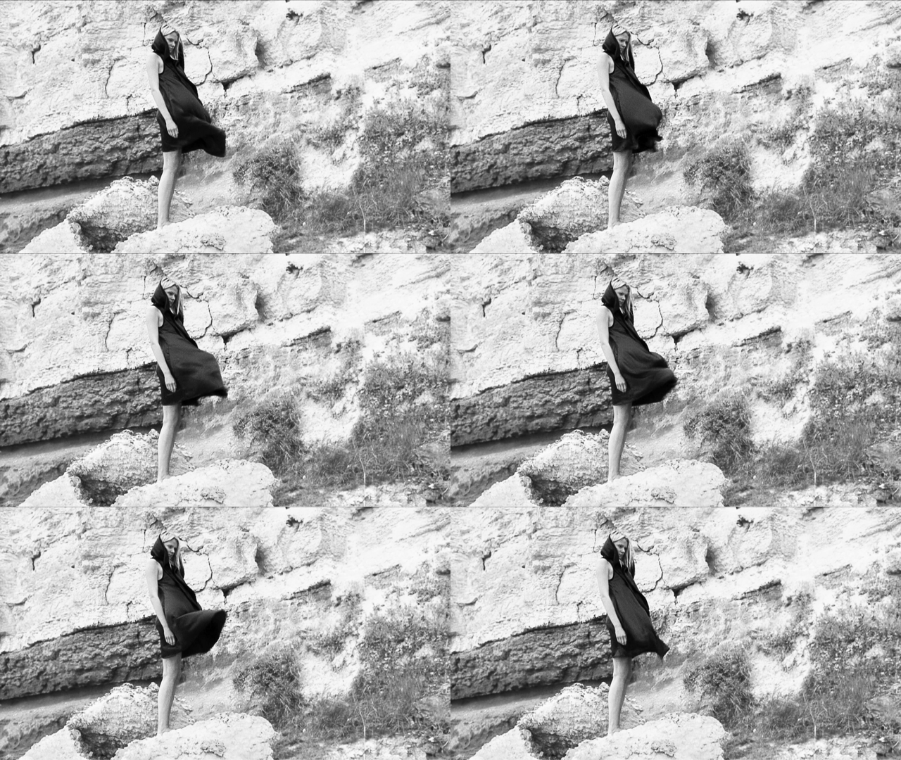
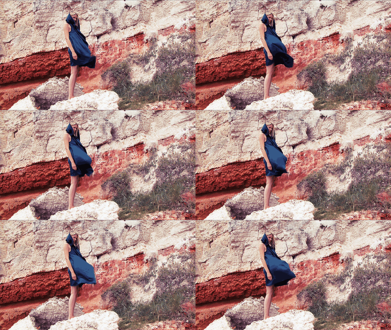
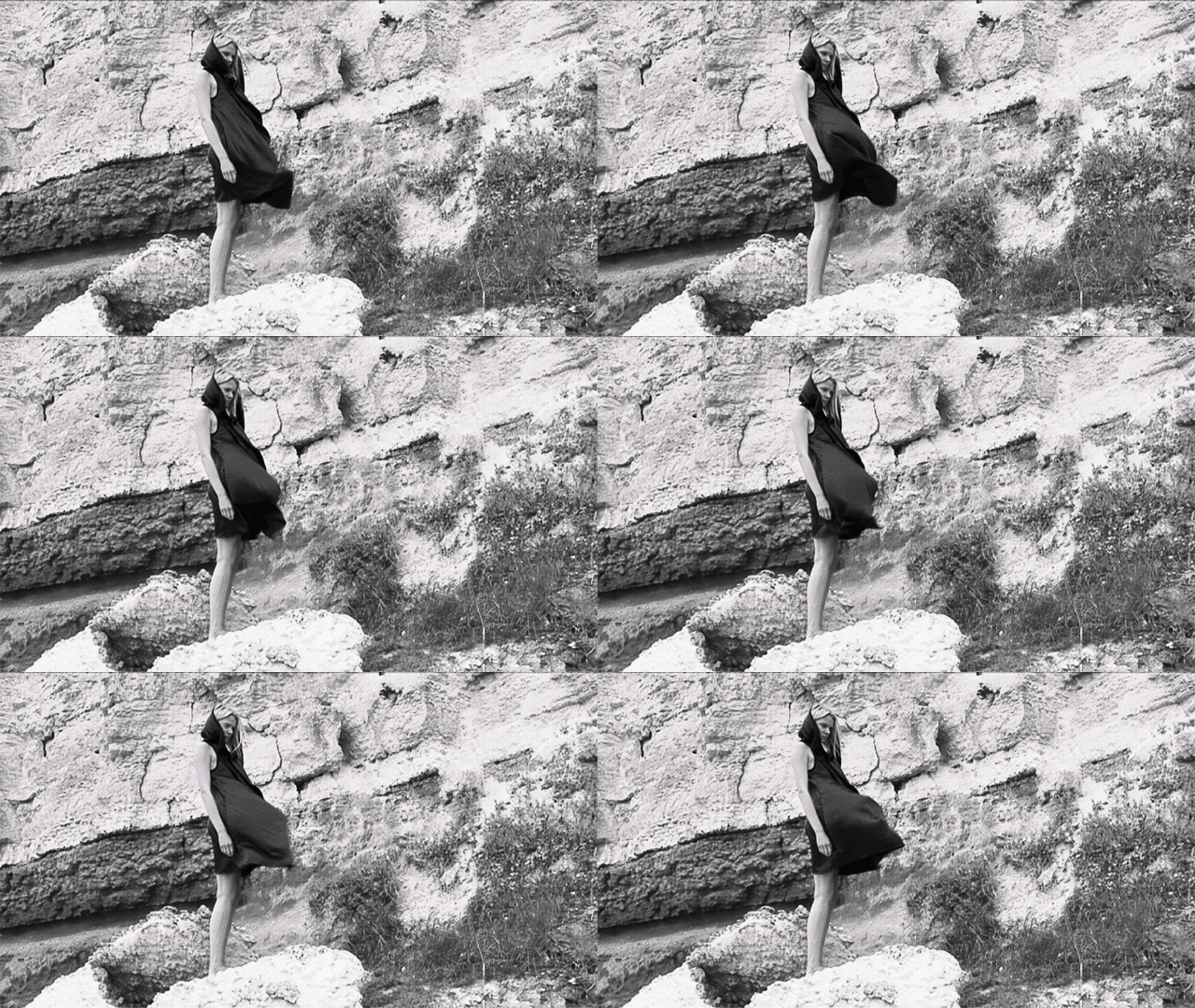
We decided to make the cinemagraphs black and white,we tried a few cinemagraphs in colour and felt it just wasn’t working. The form of the dress becomes the main focus in the black and white cinemagraphs but in colour the form gets lost in the jumble of colour. This is something to think about in the future in terms of location scouting. However saying that the texture of the rocks in black and white is great, its so harsh and raw and it contrasts with the soft delicate fabric.
Cinemagraph Jumps:
When choosing a section of footage I have to be really careful about the point at which it loops. Even though there is likely to always be a small jump because of the erratic nature of the movement it is important to try and reduce it so that the viewer isn’t jolted every time this happens. In the second cinemagraph the start and end frame are closer together in position than in the first.


Additional Movement:
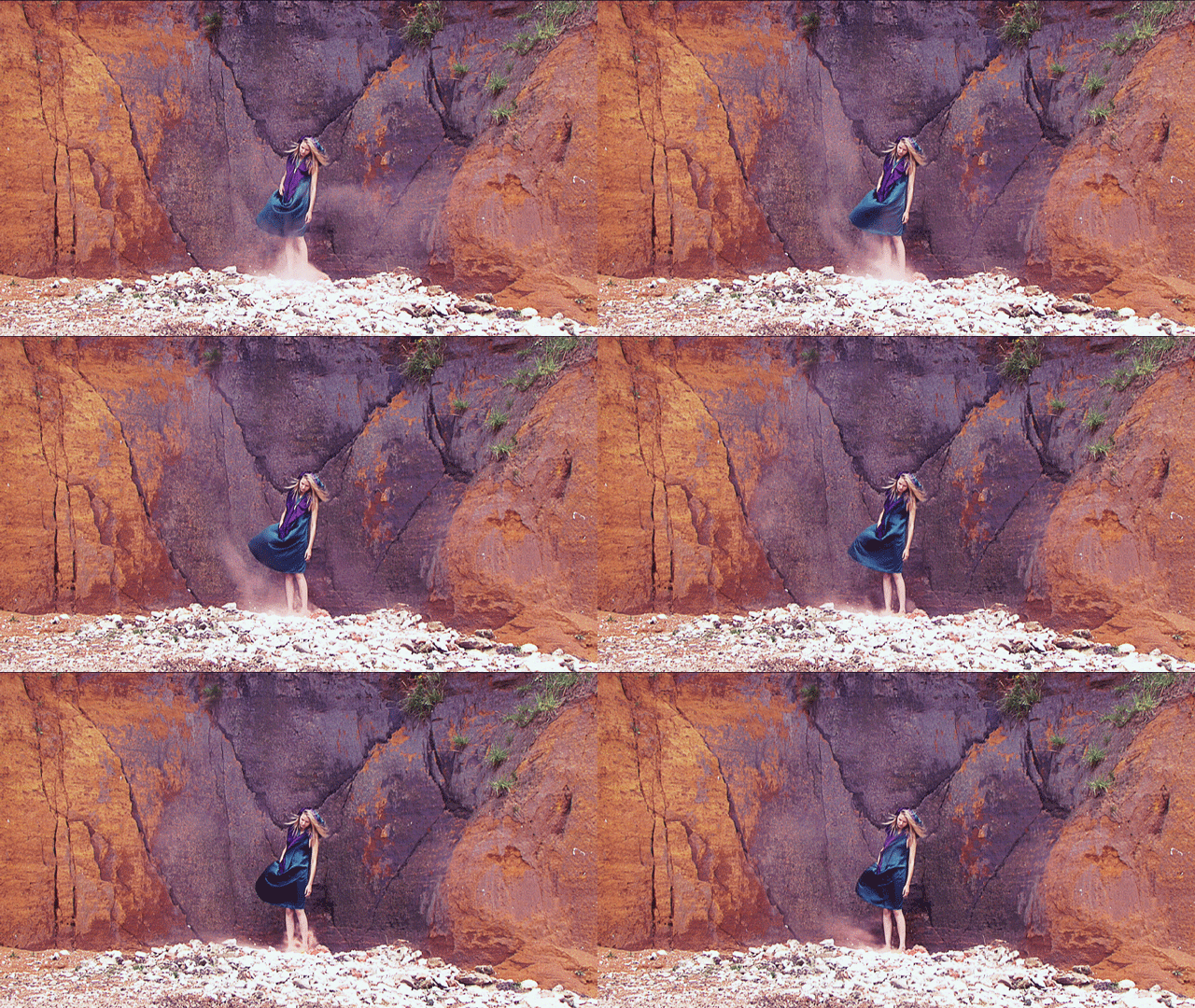
After editing down the footage we realised the extra movement of the smoke was distracting far too much from the dress. There was also not really enough smoke, the environment overpowered it and it didn’t seem strong enough to include in the final cinemagraphs.


